Meltdown – analysis of an historic picture

They say this image will go down in history. It probably will. But not just because of the moment, the people involved and the potential ramifications. Even all of that wouldn’t be enough if it wasn’t a great photograph. There’s a renaissance-like quality to it that suits the significance, and it works as a piece of art. Why? It’s all about the geometry and, of course, the lines.

Leading lines

Maybe the most striking geometrical aspect of the image is the leading lines formed by the items on the oval table, particularly the white name plaques, but also the glasses, the papers, the edges of the table itself and the people sitting round it. These lines draw the eye in from the ‘front’ of the image to where the action is, and gives a great sense of depth.

More subtle, perhaps, is the shape of the light cast by the chandelier at the very top of the image. The light falls on the wall at the back in a triangle, coming down towards Pelosi and Trump, helping to direct the eyes to them and also stopping the eyes from continuing up once they’ve followed those leading lines from the bottom.

Eyelines

Eyelines always create strong compositional elements, and here the dominant line is that created by Pelosi and Trump looking at each other. This line cuts across as the viewer’s eyes reach the ends of the leading lines from the bottom, and forms the base of the triangle formed by the light coming from the top.

In fact, the elements create two strong triangles in the image as a whole, drawn here in red and green, and this gives the photograph a solid grounding so that it feels real, almost as if you’re there, as well as energy from the diagonal lines.

Going back to that eyeline, it’s backed up by the direction in which everyone else is looking – the people on each side are looking into the frame, leading you back to those leading lines, and/or at the main characters, leading you to look at them.

The rule of thirds

Finally, we come to the rule of thirds – no image analysis is complete without it. Dividing up this frame, it becomes clear that Pelosi and Trump are sitting close to the upper intersections of the thirds and looking at each across that top third. I think the fact that Pelosi is slightly above and Trump is slightly below creates a nice balance (as well as being potentially symbolic). What’s more, this geometry is reinfored because the edges of that triangle coming down from the light point to those upper intersections, and the leading lines of those name plaques on the table intersect the divisions of the lower thirds.

The only thing that goes against the composition is the guy in the bottom left corner, who’s looking away from the action and is very close to the camera so is slightly distracting. The fact that he’s out of focus and has no light on him, however, means that he doesn’t dominate over the strong lines and geometry elsewhere.

All together, the geometry creates a great balance in the image, giving it the feel of artistic harmony. The story behind the image is anything but harmonious, but that makes the image all the more striking.

Lines and colour – Mondrian had it right

Every true artist has been inspired more by the beauty of lines and color and the relationships between them than by the concrete subject of the picture.

Piet Mondrian
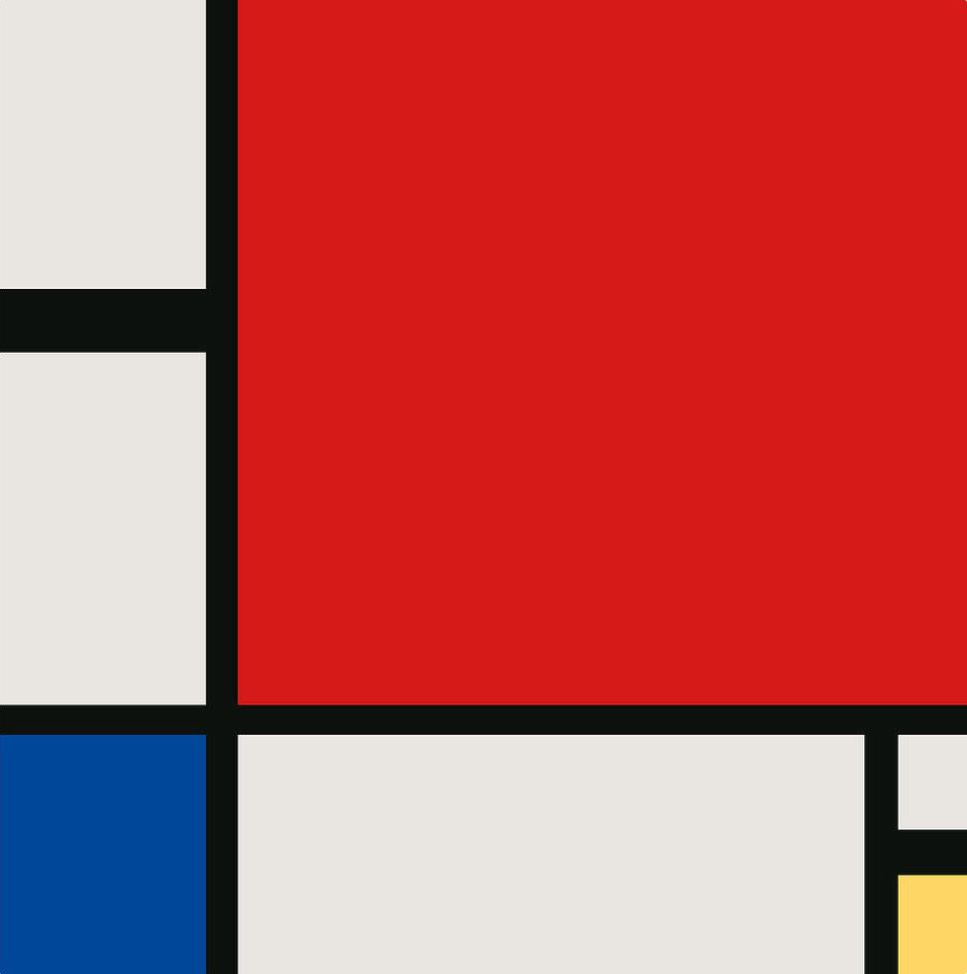
Composition II in Red, Blue and Yellow. Piet Mondrian

I just love Mondrian’s art. And his quote above expresses exactly what I have been trying to articulate to myself in the past years. His words express what I love about art – what I now realise I have always loved about art – and what I also love about photography. The beauty of lines and colour and the relationship between them.

Lines and colour are all we have to work with to create 2D images, so it’s the last part – the relationship between them – that’s the real key. These relationships are all about creating balance, and I would go so far as to say that an image in which these relationships are just right alters my mind, as though it changes the activity in my brain. While the chaos of the world seems to create unsynchronised waves of activity that clash and cause discomfort, it’s as though an image with perfect balance pulls these waves into phase with each other, as though activity in my brain becomes synchronised at the resonant frequency of my mind*, and it feels comfortable. It just feels right.

That’s where the joy and satisfaction in creating images lies for me – creating balance in an inherently unbalanced world, creating perfect order from the chaos. And for me, the medium of photography has a special magic in this respect. With drawing and painting, you start from nothing and you have the power to create balance, and that is fantastic. But with photography, you need to find balance in what is in front of you. The order you create comes directly from the chaos – it’s part of the chaos. This is why it’s so difficult, but also why creating a photograph that hits that balance is so satisfying.

*I’m a neuroscientist, I know this doesn’t make sense, but it’s how it feels! 

V&A tunnel, London

Artistic notes

  • The diagonal lines and the perspective are what drew me to this scene – they result in a great sense of depth.
  • Also like the pattern that repeats into the distance, and how this is broken by the person, who is big enough to recognise but not close enough to be the subject.
  • I had another version without any people in, but it lacked interest.
  • In processing, I cropped to the widescreen format, which gives a move-like feeling.
  • I also increased the contrast and desaturated the colours.

Technical notes

  • Sony A7s
  • 35 mm
  • f/8
  • 1/60 sec

Bryan Peterson – composition and colour with impact

Scrolling through Instagram, as I do these days after effectively ditching Facebook, I was stopped by this image.

Look at those lines! The contrast of the colours. The composition. It’s so simple, but so striking! This is the work of Bryan Peterson, a photographer you might be familiar with. I was, but I hadn’t even realised until I learnt that he’s written several really well-known photography books, including Understanding Exposure, Learning to See Creatively and Understanding Color in Photography.

The image above drew me in to look further at Peterson’s Instagram profile, and I was captivated. His feed is a fantastic fest of colour and composition, and it really got me excited! He’s a photographer who doesn’t take the sickly picture-postcard landscapes and coastal scenes that saturate photographic social media, but who has his own style. What’s more, he creates the kind of images that I want to create!

The first thing that stands out for me is his bold use of colour. You can see it in the image above, and look at the one below!

Complementary colours is a theme you can see in lots of his images – in this case, it’s beautiful use of yellow and purple. Yes, it’s a sunset, yes it’s water – it’s not an original subject, but you don’t often see landscapes with such strong colours, and I love it!

Lines are the other strong elements in many of Peterson’s images. At the top we’ve got the horizontal lines of the steps, and above we’ve got the verticals of the trees and the diagonals of created by the perspective. The image below is an abstract composition in just one (still strong) colour, but it’s again the lines that make it.

The thread that ties Peterson’s use of colour and lines together is composition. His sense of composition and balance really resonates with me, and the image below is a great example of this.

There are very strong lines and the person with the umbrella – the main focal point, but not necessarily the main subject – is offset a long way to the left, much further than would be dictated by the rule of thirds. It’s the strong red that offsets the black on the right to create balance in the image, and the placement of the elements makes this balance dynamic because it creates doubt about whether the real subject is the person or the structure and the lines that it creates.

In fact, composition is at the centre of Peterson’s philosophy, and he’s perhaps the first photographer I’ve found who shares my opinion that composition is more important than light. He says this unreservedly on his website:

‘light’ is not Holy Grail. Rare does a scene with great light salvage a poorly composed image, but rarer still does a truly compelling composition NOT salvage a scene with poor light!

For me, Peterson’s approach validates my views about composition, and the balance and look of many of his images are very close to what I intend to create with my photography. Finding someone to provide this kind of vision that aligns with your own is inspiring! I hope sharing his work with you has inspired you too!

If you are inspired, then Peterson also has a website called You Keep Shooting, through which he offers online educational resources. Through subscription to his website, he offers educational videos, webinars and critiques. Here’s a taster that Peterson has allowed me to share.

I’m off to watch some more of his videos!

All images copyright © Bryan Peterson and reproduced here with permission.

Stairway to art (or, why I photograph staircases)

My name’s Ian, and I photograph staircases.

It’s not really an addiction. But if I see a ‘really good’ staircase and I don’t have my camera with me, I am annoyed. Quite annoyed.

It’s a longstanding project that’s been going for almost as long as I’ve had a camera (almost 9 years). It started out subconsciously as I just photographed what I like, but it turned out that I like staircases a lot and has become very much a conscious project.

Why staircases? Good question.

Lines. It’s the lines.

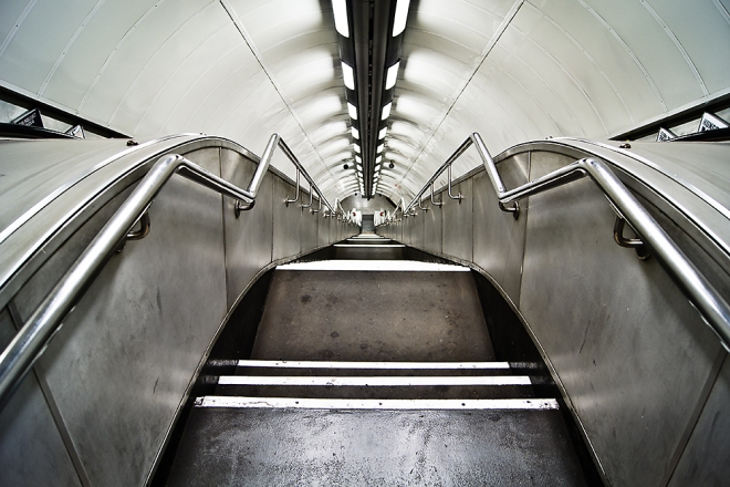
Stairs at Hyde Park Corner Underground station, London, UK
There are so many lines in this photograph that create geometrical shapes, depth, form and an incredible sense of perspective. It’s all about the lines!

The longer I’ve been taking photographs, the more I’ve realised that what I really love about it is the composition of lines and geometry. And where better to find lines and geometry than staircases? If they’re straight, they’re beautifully uniform. If they’re a spiral, they have wonderful geometric curves and contrasting straight lines. If they’re wonky, they’re unusual, but the lines are still there. With staircases, you just cannot get away from lines.

Arranging these lines in the frame to create balanced compositions and striking images is what this staircase project is about. Stairs also necessarily involve surfaces in different planes, and this usually means that the light plays on them nicely to create form. Of course, if you’re at one end of the stairs or the other, the staircase also goes into the distance, creating yet more diagonal lines and a strong sense of perspective. The lines are so simple, yet so complex in the way they can be arranged in the frame.

Stairs are everywhere

Yes, this means that no matter where you are, there’s always a staircase available to photograph. That makes it pretty easy to accumulate material for this project, but that’s not what I mean.

Staircases have been made by humans for centuries, in every culture in every corner of the world. They are a symbol of the intelligence that is universal among our species, and they demonstrate how we use this intelligence to manipulate our surroundings. Whether it’s a few rocks on top of one another, steps carved into a mountainside, or a wooden staircase constructed in a modern house, the simple idea of creating stairs to reach otherwise unreachable elevations is a triumph of human history.

Stairs at the castle in Lisbon, Portugal, have been there for hundreds of years.

One step at a time

Finally, stairs are symbolic of a concept that is crucial in the human condition. When faced with a challenge that seems insurmountable, you need to break it down. Into steps. And take one step at a time. And that’s precisely what stairs do. They break down an insurmountable leap into small steps and put the unreachable within our grasp.

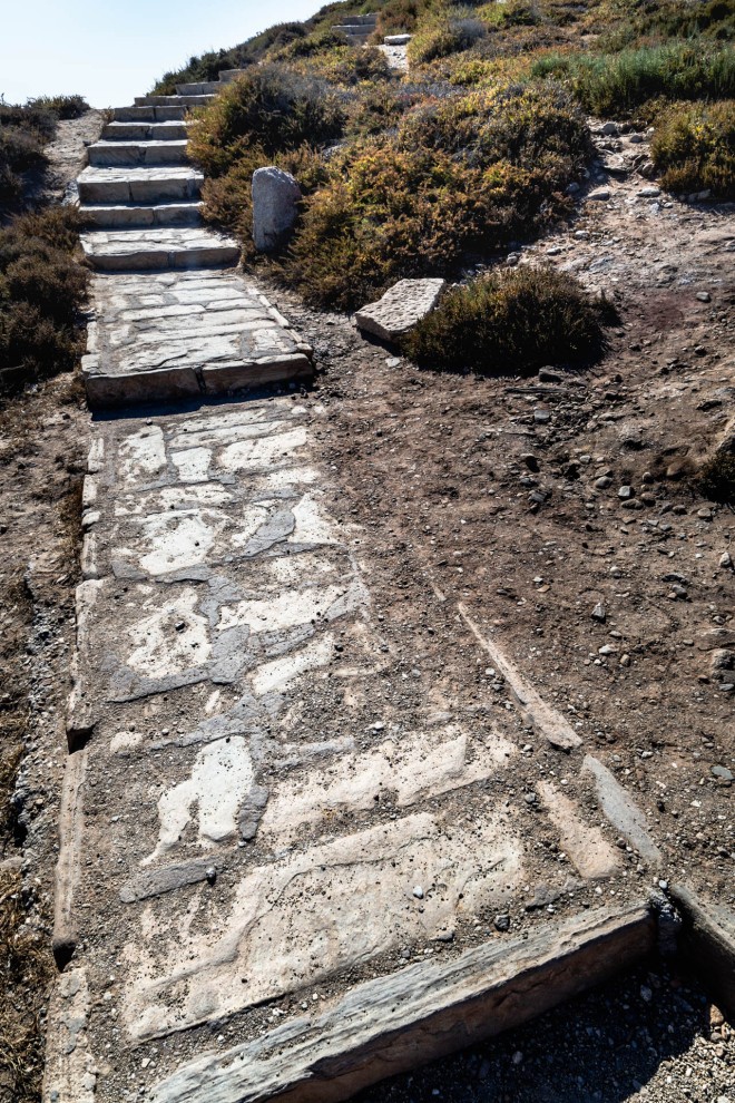
Staircase in Naxos, Greece, that appears to lead nowhere

Not only that, but they take us to a different level, and this physical ascent is symbolic of the progress that can be made when we take steps towards an ultimate goal.

In short, staircases are symbols of human achievement, advancement and of hope, and they create wonderful compositions of lines and geometry. What better photographic subject could you hope for?

Here are a few more images from my staircases project – take a look at the whole collection on my portfolio site.

The three powers of projects

In photography, as in any art, it’s easy to lose your way. To photograph anything and everything so that you lose a sense of what you are trying to create with your photos. The result can be boredom, indifference, and a lack of motivation that eventually results in the camera staying in the cupboard. That’s where projects come in, and they can help in three ways.

1. Constraints breed creativity

If you can choose to do or have absolutely anything, it’s impossible to choose. You’re paralysed by the possibilities or you try to choose everything. It’s the same with photographic subjects. Although it doesn’t seem intuitive, the constraint of a project breeds creativity. It gives the brain something concrete to work with, a topic to explore and look at from all angles. It might start off with mediocre images, but the creative juices soon get going and you’ll find you come up with images that are much more original.

These images are part of a macro project I started just after my daughter was born, when my opportunities to get out to take pictures were limited. I ended up focusing more specifically on spiders in the garden, and over a few weeks, I went from obvious, fairly standard images like the one on the left to much more original ones like the other two.

What’s more, you can have projects that are open-ended, and when you’re stuck for knowing what to photograph, you can fall back on these to at least get you started. I have several of these ongoing projects – the longest running is a project of staircases, but there’s also shadows, lost clothing, harbours, panoramas and more.

2. You build a body of work

To feel like you’re getting somewhere, it’s nice to see your portfolio building. Projects give you direction and a reason for organising your images. As you shoot a few images here and there, you find these building up into satisfying collections. You also get a better idea of what is working for you in the project and what isn’t, helping you to make images with more purpose and direction for the project in future. One fantastic way of watching your projects build is to organise your collated images on a portfolio website. This not only allows other people to see your work, meaning you can easily ask for feedback if you want it, but also allows you to easily see how the images are working together and to chop and change the collection as you see fit.

If you use Adobe Creative Cloud applications, such as Lightroom and Photoshop, then you’ll have the option of creating a site with Adobe Portfolio for no extra cost. I’ve just done that, and I’d highly recommend it for a simple-to-use solution that gives a sleek and streamlined finish.

My portfolio homepage, made with Adobe Portfolio

3. Images are better together

It’s tough – no, impossible – to take those top-drawer photographs with every release of the shutter. The fact is, only a fraction of the images we make will deserve to make our portfolios as standalone works of art. Projects provide a different way to create art in which images contribute to a bigger body of work that ends up being bigger than the sum of its parts.

As an example, my ongoing staircases project has produced some unbelievably average photographs. I mean, they’re stairs, what can you expect. I like photographing staircases because of their strong lines and geometry, the way light plays on the different surfaces, and their symbolism of progression, advancement, improvement. Although many of the images include unusual or visually interesting staircases, each photograph is still essentially an image of some stairs. But together, these images create something much bigger.

Take the image below. It’s a staircase in Lisbon, Portugal. It’s slightly unusual in that it leads down onto the beach and the bottom steps seem to merge with the sand. But on its own, this image is nothing particularly spectacular.

Put it in a group of images of several other staircases in Lisbon though, and suddenly you have something. A collection of unusual staircases that say something about the place and create something of an atmosphere.

Now put this set into a collection of images of unusual staircases from other places, and this becomes something else again. At the least, it is an interesting collection that shows how the idea of steps has been adapted for various contexts. At the most, it is a commentary on the universality of staircases, on the singularity of our species and on the diversity, yet convergence, of our intelligence. It could also speak of the universal striving for progression and improvement.

Below is a selection from the current version of my staircases project. You can see the full collection here.

Try it

So next time you’re stuck for something to photograph, start a little project for yourself. It could be something that takes 20 minutes and produces one final image, or it could last a lifetime and evolve with you. It could be as general as portraits or trees, or it could be specific – all the piers in the UK, all the species of insect you can find in your garden, or each petal of a single flower. No matter what it is, a project has the power to free your creativity.

If you have any projects you’re working on or you have any great ideas for projects, we’d love to hear about them – just leave a comment below!

Photography and fear

I am afraid. Creative work makes me afraid.

I am afraid that people will judge my work unfavourably and judge me for thinking I am any good as an artist. Because I am afraid I am not.

I am afraid that people won’t judge my work at all. That they just won’t care. That my creative efforts will echo in a void of indifference.

I am afraid of liking my work. What does it matter if I like it? That means nothing.

I am afraid of not liking my work. If I don’t like it, how can I expect other people to like it?

I am afraid of not knowing if I like my work. How can I tell if I like it? I’m biased.

I am afraid that I will reveal too much of myself, and judgement of my work becomes judgement of me.

I am afraid of revealing too little of myself, so that my work is meaningless.

I am afraid that I have got it wrong, and it’s obvious from my work.

I am afraid to fail. Whatever that means.

I am afraid of not creating. But my fear stops me.

Notes from the Aegean – ground tree

Some of my postcards from the Aegean were taken at the top of the highest point on the tiny island of Iraklia – I hesitate to call it a mountain at 400 metres, but that’s what it seems like in the context of the island. Anyway, the photograph above is one of many many small tree-like, shrub-type things that grow almost flat to the ground at the peak. Clearly I don’t know what they are or whether they are alive or frazzled in the Greek sun (I’ll refer to the them as trees), but I really liked what they looked like, and I decided to photograph them. I had in mind to make a small collection of black & white images, focusing on the twisted forms and the coarse textures. Neither the collection nor the black & white worked out!

When I opened the images of these trees on screen (I could barely see them on the camera LCD because the sun was so bright), I didn’t like most of them. When I took them, it was around midday and the sun was high, creating harsh shadows if the trees weren’t completely flat to the ground. What’s more, in most images, the textures of the ground were too similar to those of the plants, so what was intended as my subject didn’t really stand out. Only this one image above worked for me, so that was the end of a collection.

I think this one image works better because the plant is closer to the ground so there are fewer shadows, and those that there are are at the edges and blend in with the texture of the tree itself. Also, this tree was sitting on a relatively flat rock, so there is a contrast of texture between subject and background. However, when I converted to black & white (below), I didn’t like it at all. The colours were all too similar across the frame to create much contrast with the colour mixers in Lightroom, and the textures really didn’t stand out like I wanted them to.

So I turned to my backup plan when I want the effect of black & white (greater focus on lines, shapes and textures than on colours) but simple monochrome doesn’t quite work – partial desaturation. I find this works well when colour is necessary but you don’t want it to dominate.

Doing this here reduced the strength of the colours, preventing the orange hues from dominating and actually revealing subtle complementary blueish and orange hues. This makes the image pop and emphasizes the textures as I wanted to. In addition to the diagonal that the plant makes from bottom right to top left, the desaturation created a lovely balance in the image.

Image analysis – breaking the rules for balance and tension

A lone cyclist, making his way into the city on a misty morning. One of my favourite photographs, made in 2013. I love this photograph because it has atmosphere. The cyclist seems isolated and you feel remote from him as the viewer, yet you know how he feels. There’s an overall feeling of peace, but there’s also a balance and tension that creates a sense of movement and urgency – where’s he going? It seems like a simple photograph, but when you look into it closely, there are some interesting things happening.

Two distinct layers

The mist has a fair amount to do with the atmosphere. This image wasn’t made early in the morning, it was just a foggy day, but it conjures up that feeling of an early winter morning. I used the mist in a very deliberate way to maximise its impact. I positioned myself so that the people walking and cycling along the path were just in front of the haze so that they were dark but everything behind them was hazy. This creates two distinct layers – the background is effectively flattened to a single layer dominated by the misty outline of the city scape, and the cyclist is in front. This separation, along with the fact that no other people appear in the frame (I was there some time for the perfect subject and no-one else to be in my viewfinder), this creates the feeling of isolation and peace.

The most interesting part of this photograph to me though is that, although there’s essentially one point of focus – the cyclist – it’s dynamic. There’s a trade-off between balance and tension, and this is all down to the composition.

Balance

The cyclist is placed precisely on the right hand third of the frame (below), adhering neatly to the classic rule of thirds, at least in one dimension. However, the placement of the cyclist breaks more ‘rules’ than it adheres to, and this is where it starts to get interesting.

The cyclist is not on the vertical third of the frame, but is low. Had he been placed on the intersection of thirds a little higher, there would have been too much foreground. What allows this placement to work is the compositional element that, for me, trumps everything else – balance.

The misty church spire provides the balance for the cyclist here. This works in two ways. First, their relative positions create an implied diagonal in the image (below), and the spire balances out the visual mass of the cyclist. I’ll come back to that diagonal in a moment.

Second, they serve the same function in the top and bottom halves of the image. If you divide the frame into two, it’s almost exactly divided along the top of the buildings in the background, creating a light top half and darker bottom half (below). The church spire and the cyclist are both darker blocks in their respective halves of the image, so they draw the eye, emphasizing the diagonal between them.

Tension

The placement of the cyclist not only creates the balance with the church spire, but also creates tension. Rather, the direction he’s facing creates tension. The rule book says to give moving subjects space to move into the frame, and the cyclist facing the edge of the frame implies movement that pulls the eye out of the image. So why does this rule-breaking work here?

To think about this, let’s turn the cyclist to face the other way. I’ve done that (very crudely) below, and cropped the frame a little at the right – that crop is needed to maintain the balance between the church and the cyclist, and that’s an important clue to what’s going on here.

When the cyclist’s facing the opposite direction, it’s a very different image. The diagonal between the spire and cyclist is now joined by a horizontal underneath that’s implied by the cyclist’s movement. Effectively, these implied lines create a triangle (below), leading to a closed image that’s well balanced but without much tension.

Going back to the original, that could be cropped in the same way to create a squarer frame.

The balance between the cyclist and church spire is still there, but the image doesn’t work, because the cyclist is too close to the edge. That triangle is still there, but the movement of the cyclist away from it means it’s just an empty space in the image.

Put that space on the right back, though, and the cyclist suddenly has space to move into (below). What’s happening here is that the diagonal between the church spire and cyclist implies a ‘frame within a frame’, and the space to the right of that is now sufficient for the cyclist to move into.

Rather than creating the triangle, the diagonal and the horizontal movement creates an open line that adds dynamism, creates tension, and leads the eye right across the image in the direction that the bike is going. This line creates movement and that sense of urgency.